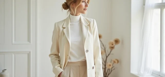
In front of a full wardrobe, it often takes ten minutes to put together an outfit because the colors clash. The problem isn’t the number of clothes; it’s the lack of a cohesive color thread. Establishing a coherent palette before choosing any piece radically transforms the fluidity of a minimalist wardrobe.
Warm Neutrals Palette: The Foundation of the Minimalist Look in 2025
For a long time, the streamlined wardrobe was built around black, white, and gray. This base worked, but it often resulted in a clinical, almost austere look. The recent trend of quiet luxury has shifted the codes towards warm neutrals: sandy beige, taupe, cocoa brown, ecru. We maintain sobriety while gaining softness.
The operational principle is simple: limit yourself to a maximum of three neutrals for the entire wardrobe. Not two, not five, three. This constraint forces the elimination of orphan pieces and ensures that each garment can be combined with all the others. Specifically, you choose a light neutral (ivory or ecru), a medium neutral (camel or taupe), and a dark neutral (charcoal, navy, or chocolate).
You can delve deeper into minimalist style on Ou pas to understand how this rule of three neutrals applies piece by piece.
Cool grays do not disappear entirely, but they are receding. When hesitating between a cement gray sweater and a greige one, the latter integrates more easily into a warm palette and gives a less rigid look in natural light.

Accent Colors in a Minimalist Wardrobe: How to Balance
A 100% neutral wardrobe can become tedious. The question is not whether to add color, but how much and in what form. In minimalist fashion, one accent color is enough to structure dozens of outfits.
Choosing Your Accent Color Based on Your Trio of Neutrals
The accent color should create a readable contrast without breaking the harmony. Here are combinations that work in practice:
- Ivory, camel, charcoal trio: a deep blue (dark navy or ink) adds structure without harshness
- Ecru, taupe, chocolate trio: a sage green or olive green fits within the earthy tones while adding depth
- White, greige, black trio: a burgundy or terracotta warms the whole and avoids a flat monochrome effect
Greens and mineral tones are gaining ground in recent trends, associated with well-being and nature. In a minimalist wardrobe, they function as “semi-warm” neutrals that do not overwhelm the silhouette.
Where to Place Color in a Streamlined Outfit
Concentrate the accent color on a single piece per outfit, never more. A sage green sweater with taupe pants and an ecru coat. Or a burgundy scarf with a total charcoal look. Multiplying color points destroys the streamlined effect.
Accessories (bag, shoes, belt) are the most economical lever to introduce this accent color without multiplying purchases. A terracotta leather bag used daily is enough to define the entire wardrobe.
Color Mistakes That Sabotage a Streamlined Style
There is much talk about what to wear. Identifying concrete mistakes is more useful because they explain why some “minimalist” wardrobes do not work visually.
Mixing warm neutrals and cool neutrals in the same outfit creates a subtle but visible discrepancy. Pure black pants (cool neutral) with a cream top (warm neutral) create a temperature dissonance. On a hanger, it seems fine. Worn, under natural light, the two tones “push away” from each other. Stick to one temperature family per outfit, or embrace a stark contrast (pure black and white, for example).
Another common pitfall: accumulating variants that are too close to the same neutral. Three slightly different beiges worn together give an “ill-matched” effect rather than a tonal effect. For a successful tonal look, there needs to be a visible value difference between light and dark, at least two shades apart on a brightness scale.
Opinions vary on this point, but all-black outfits also pose a problem in contemporary minimalist fashion. Total black is graphic, not streamlined in the current sense. It flattens the silhouette and eliminates the texture play that warm neutral palettes seek.
Building Your Minimalist Palette: Elimination Method
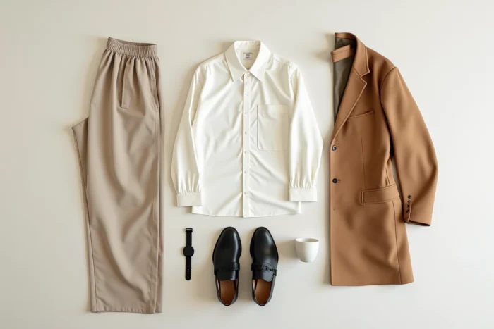
Starting from a blank page to choose your colors doesn’t work. You start from what you already wear and eliminate.
First step: take out the ten pieces you wear most often. Identify the dominant temperature (warm or cool) and the two or three colors that recur. This natural core becomes the base of the palette, not a color chart found online.
Second step: remove any piece that does not combine with at least three others. If a sweater only “goes” with one pair of pants, it is removed from rotation. This sorting generally eliminates a third of the wardrobe effortlessly.
Third step: identify the gap. Generally, it’s an intermediate neutral (the famous “medium” between light and dark) or the accent color. You only buy what fills this specific gap.
This method works because it is rooted in real habits, not in a theoretical ideal. A minimalist wardrobe does not need to be perfect on paper. It must produce coherent outfits in under two minutes every morning. The color palette is the tool that makes this possible, provided you keep it tight and resist the temptation to add “just one” print or “just one” additional shade.